Overview
- File structure
- Hello World Desklet
- Debugging
- Icons
- Box-Layout
- Button
- Styling
- Settings
- Images
- Mainloop
- Translation
File structure
The source code of all desklets can be found in this GitHub repository.
We create a fork from this repository and add our new desklet in a new folder.
The folder must be named after the desklet's UUID. This consists of the desklet name, an @, and the GitHub username. For this example, tutorial-desklet@KopfdesDaemons.
We set up the following file structure:
tutorial-desklet@KopfdesDaemons
    └── files
    │    └── tutorial-desklet@KopfdesDaemons
    │        ├── desklet.js
    │        ├── icon.png
    │        ├── metadata.json
    │        ├── settings-schema.json
    │        └── stylesheet.css
    ├── info.json
    ├── README.md
    └── screenshot.png
In the info.json we only add the author:
{
  "author": "KopfdesDaemons"
}
The README.md and screenshot.png are displayed on the Cinnamon website.
The metadata.json looks like this:
{
  "uuid": "tutorial-desklet@KopfdesDaemons",
  "name": "Tutorial Desklet",
  "description": "This is a tutorial desklet.",
  "version": "1.0",
  "max-instances": "50"
}
Hello World Desklet
To explain the structure of desklet.js, we start with a simple Hello World desklet.

const Desklet = imports.ui.desklet;
const St = imports.gi.St;

class MyDesklet extends Desklet.Desklet {
  constructor(metadata, deskletId) {
    super(metadata, deskletId);
    this.setHeader("Tutorial Desklet");
  }

  on_desklet_added_to_desktop() {
    this._setupLayout();
  }

  _setupLayout() {
    const label = new St.Label({ text: "Hello World!" });
    this.setContent(label);
  }
}

function main(metadata, deskletId) {
  return new MyDesklet(metadata, deskletId);
}
We can test the desklet with this command:
./test-spice tutorial-desklet@KopfdesDaemons -sThe -s parameter skips desklet validation. This is useful if not all files, such as screenshot.png, are present yet.
Debugging
We can log messages to the console:
global.log("test");
global.logError("error");
You can open the console by right-clicking on the taskbar, selecting "Troubleshoot" and then "Looking Glass".
Icons
So far, we don't have many imports. In addition to Desklet, we also import St for the label we display. St stands for Shell Toolkit and provides UI elements. The Shell Toolkit is based on Clutter, an OpenGL-based library for displaying UI elements on a canvas.
With the Shell Toolkit, we can display even more elements. Next, let's replace our label with an icon:
const Desklet = imports.ui.desklet;
const St = imports.gi.St;

class MyDesklet extends Desklet.Desklet {
  constructor(metadata, deskletId) {
    super(metadata, deskletId);
    this.setHeader("Tutorial Desklet");
  }

  on_desklet_added_to_desktop() {
    this._setupLayout();
  }

  _setupLayout() {
    const icon = new St.Icon({
      icon_name: "face-smile-symbolic",
      icon_type: St.IconType.SYMBOLIC,
      icon_size: 32,
    });
    this.setContent(icon);
  }
}

function main(metadata, deskletId) {
  return new MyDesklet(metadata, deskletId);
}
The icon names can be found under /usr/share/icons/Adwaita/symbolic.
Box-Layout
So far, we've only set one element as the desklet's content. Next, let's display the label and icon together. To display more than one element, we need a box layout.

const Desklet = imports.ui.desklet;
const St = imports.gi.St;

class MyDesklet extends Desklet.Desklet {
  constructor(metadata, deskletId) {
    super(metadata, deskletId);
    this.setHeader("Tutorial Desklet");
  }

  on_desklet_added_to_desktop() {
    this._setupLayout();
  }

  _setupLayout() {
    const box = new St.BoxLayout({ vertical: true });

    const label = new St.Label({ text: "Hello World!" });
    const icon = new St.Icon({
      icon_name: "face-smile-symbolic",
      icon_type: St.IconType.SYMBOLIC,
      icon_size: 32,
    });

    box.add_child(label);
    box.add_child(icon);

    this.setContent(box);
  }
}

function main(metadata, deskletId) {
  return new MyDesklet(metadata, deskletId);
}
Button
Now let’s add some logic and change the displayed icon with a click on a button:

const Desklet = imports.ui.desklet;
const St = imports.gi.St;
class MyDesklet extends Desklet.Desklet {
constructor(metadata, deskletId) {
super(metadata, deskletId);
this.setHeader("Tutorial Desklet");
this.iconName = "face-smile-symbolic";
}
on_desklet_added_to_desktop() {
this._setupLayout();
}
_setupLayout() {
const box = new St.BoxLayout({ vertical: true });
const label = new St.Label({ text: "Hello World!" });
const icon = new St.Icon({
icon_name: this.iconName,
icon_type: St.IconType.SYMBOLIC,
icon_size: 32,
});
const button = new St.Button({ label: "Change Icon" });
button.connect("button-press-event", () => this._changeIcon());
box.add_child(label);
box.add_child(icon);
box.add_child(button);
this.setContent(box);
}
_changeIcon() {
this.iconName = this.iconName === "face-smile-symbolic" ? "face-sad-symbolic" : "face-smile-symbolic";
this._setupLayout();
}
}
function main(metadata, deskletId) {
return new MyDesklet(metadata, deskletId);
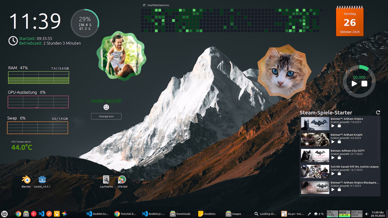
}Now the smiley becomes sad when we press the "Change Icon" button.
Styling

We can add a style_class to the elements from the Shell Toolkit.
const label = new St.Label({ text: "Hello World!", style_class: "tutorial-desklet-label" });
const button = new St.Button({ label: "Change Icon", style_class: "tutorial-desklet-button" });
We can then customize the elements in the stylesheet.css with CSS:
.tutorial-desklet-label {
  font-size: 2em;
  color: green;
}

.tutorial-desklet-button {
  padding: 0.5em;
  border: solid 1px rgb(165, 161, 161);
  border-radius: 5px;
  margin-top: 1em;
}

.tutorial-desklet-button:hover {
  background-color: rgb(173, 173, 173);
}
Some changes in the stylesheet.css file will only become visible after restarting the Cinnamon desktop. To do this, right-click on the taskbar and select "Restart Cinnamon" under "Troubleshoot".
The style can also be adjusted using JavaScript:
label.style = `font-size: 2em; color: green;`;
label.set_style(`font-size: ${this.labelFontSize}px;`);
The CSS is only rudimentarily implemented. Only basic properties like margin, padding, color, border, and font-size work. Everything related to the layout is controlled via the box layout. Flexbox does not work.
Hover Effects
Hover effects work for buttons. If other elements are to be given a hover effect, the Shell Toolkit element must be adapted with the track_hover and reactive parameters:
const box = new St.BoxLayout({ style_class: "tutorial-desklet-box", reactive: true, track_hover: true });Settings
The desklet settings are defined in the settings-schema.json.
{
  "head0": {
    "type": "header",
    "description": "Style"
  },
  "label-font-size": {
    "type": "scale",
    "default": 20,
    "min": 12,
    "max": 60,
    "step": 1,
    "description": "Font size",
    "tooltip": "The font size of the label."
  }
}
The Settings API is documented. Here are the most important settings types:
- entry
- checkbox
- scale
- combobox
- spinbutton
- filechooser
- colorchooser
- datechooser
A new import is required, and the settings must be bound.
Here's a simple Hello World desklet that allows you to change the font size:
const Desklet = imports.ui.desklet;
const St = imports.gi.St;
const Settings = imports.ui.settings;

class MyDesklet extends Desklet.Desklet {
  constructor(metadata, deskletId) {
    super(metadata, deskletId);
    this.setHeader("Tutorial Desklet");

    this.isReloading = false;
    this.labelFontSize = 20;

    this.settings = new Settings.DeskletSettings(this, metadata["uuid"], deskletId);
    this.settings.bindProperty(Settings.BindingDirection.IN, "label-font-size", "labelFontSize", this._setupLayout.bind(this));
  }

  on_desklet_added_to_desktop() {
    this._setupLayout();
  }

  on_desklet_removed() {
    if (this.settings && !this.isReloading) {
      this.settings.finalize();
    }
  }

  on_desklet_reloaded() {
    this.isReloading = true;
  }

  _setupLayout() {
    const label = new St.Label({ text: "Hello World!", style_class: "tutorial-desklet-label" });
    label.set_style(`font-size: ${this.labelFontSize}px;`);

    this.setContent(label);
  }
}

function main(metadata, deskletId) {
  return new MyDesklet(metadata, deskletId);
}
Images

To display images, we need helper functions and three additional imports.
Here's a desklet that displays only one image:
const Desklet = imports.ui.desklet;
const St = imports.gi.St;
const GdkPixbuf = imports.gi.GdkPixbuf;
const Clutter = imports.gi.Clutter;
const Cogl = imports.gi.Cogl;

class MyDesklet extends Desklet.Desklet {
  constructor(metadata, deskletId) {
    super(metadata, deskletId);
    this.setHeader("Tutorial Desklet");
  }

  on_desklet_added_to_desktop() {
    this._setupLayout();
  }

  _setupLayout() {
    const image = this._getImageAtScale(`${this.metadata.path}/images/cat.jpg`, 200, 300);
    this.setContent(image);
  }

  _createActorFromPixbuf(pixBuf) {
    const pixelFormat = pixBuf.get_has_alpha() ? Cogl.PixelFormat.RGBA_8888 : Cogl.PixelFormat.RGB_888;
    const image = new Clutter.Image();
    image.set_data(pixBuf.get_pixels(), pixelFormat, pixBuf.get_width(), pixBuf.get_height(), pixBuf.get_rowstride());

    return new Clutter.Actor({
      content: image,
      width: pixBuf.get_width(),
      height: pixBuf.get_height(),
    });
  }

  _getImageAtScale(imageFilePath, requestedWidth, requestedHeight) {
    try {
      const pixBuf = GdkPixbuf.Pixbuf.new_from_file_at_size(imageFilePath, requestedWidth, requestedHeight);
      return this._createActorFromPixbuf(pixBuf);
    } catch (e) {
      global.logError(`Error loading image ${imageFilePath}: ${e}`);
      return new St.Label({ text: "Error" });
    }
  }
}

function main(metadata, deskletId) {
  return new MyDesklet(metadata, deskletId);
}
Mainloop

The main loop is used to call functions after a specific time period. With this, we can set a timeout and pass a function that executes after the timeout.
Here's a simple desklet that increments a counter every 5 seconds:
const Desklet = imports.ui.desklet;
const St = imports.gi.St;
const Mainloop = imports.mainloop;

class MyDesklet extends Desklet.Desklet {
  constructor(metadata, deskletId) {
    super(metadata, deskletId);
    this.setHeader("Tutorial Desklet");

    this._timeoutId = null;
    this._counter = 0;
    this._label = null;
  }

  on_desklet_added_to_desktop() {
    this._label = new St.Label({ style_class: "counter-label" });
    this.setContent(this._label);
    this._updateUI();
    this._runTimer();
  }

  _runTimer() {
    // Ensure no multiple loops are running
    this._stopTimer();

    this._timeoutId = Mainloop.timeout_add_seconds(5, () => {
      this._counter++;
      this._updateUI();
      return true; // Keeps the timeout active
    });
  }

  _updateUI() {
    this._label.set_text(`Counter: ${this._counter}`);
  }

  _stopTimer() {
    if (this._timeoutId) {
      Mainloop.source_remove(this._timeoutId);
      this._timeoutId = null;
    }
  }

  on_desklet_removed() {
    this._stopTimer();
  }
}

function main(metadata, deskletId) {
  return new MyDesklet(metadata, deskletId);
}
The timeout can also be set in milliseconds:
this.timeout = Mainloop.timeout_add(300, () => this._updateCounter());Translation
For the translation we need some boilerplate:
const GLib = imports.gi.GLib;
const Gettext = imports.gettext;

const UUID = "tutorial-desklet@KopfdesDaemons";

Gettext.bindtextdomain(UUID, GLib.get_user_data_dir() + "/locale");

function _(str) {
  return Gettext.dgettext(UUID, str);
}
With this code, we can use the translations with the _() function.
Here is an example call to a translation:
const label = new St.Label({ text: _("Hello World!") });Extract translation
The following command creates a .pot file in the po folder containing the text to be translated:
./cinnamon-spices-makepot tutorial-desklet@KopfdesDaemonsWe can open this file with a program like Poedit to add translations.
We'll save the translation as de.po for the German language, for example. The .mo file must be deleted.
We can install and test the translation with this command:
./cinnamon-spices-makepot tutorial-desklet@KopfdesDaemons --installHere is a Hello World desklet with translation:
const Desklet = imports.ui.desklet;
const St = imports.gi.St;
const GLib = imports.gi.GLib;
const Gettext = imports.gettext;

const UUID = "tutorial-desklet@KopfdesDaemons";

Gettext.bindtextdomain(UUID, GLib.get_user_data_dir() + "/locale");

function _(str) {
  return Gettext.dgettext(UUID, str);
}

class MyDesklet extends Desklet.Desklet {
  constructor(metadata, deskletId) {
    super(metadata, deskletId);
    this.setHeader(_("Tutorial Desklet"));
  }

  on_desklet_added_to_desktop() {
    this._setupLayout();
  }

  _setupLayout() {
    const label = new St.Label({ text: _("Hello World!") });
    this.setContent(label);
  }
}

function main(metadata, deskletId) {
  return new MyDesklet(metadata, deskletId);
}